Ursula Not Ursula, an exhibition of drawings and screenprints by Meaghan Hyckie, features repeated, twinned imagery presented as diptychs. This work continues Hyckie’s exploration of utopic planning ideals and contradictions. Suburban landscapes incorporating graphical textures from city-building videogames and optical patterns are exhibited alongside atmospheric imagery, atomic or astronomic forms that reference computer operating systems in their titles. The organizational systems that inform Hyckie’s work reflect ephemeral ideals and anxieties that connect with the broader themes of this exhibition: versioning, obsolescence and reincarnation.
In preparation for this exhibition Hyckie discussed her work with her colleague and friend, the Winnipeg-based artist Sylvia Matas. You can read their interview below.
Opening Reception
November 14, 2020 10:00 am – 5:00 pmArtist Links
-
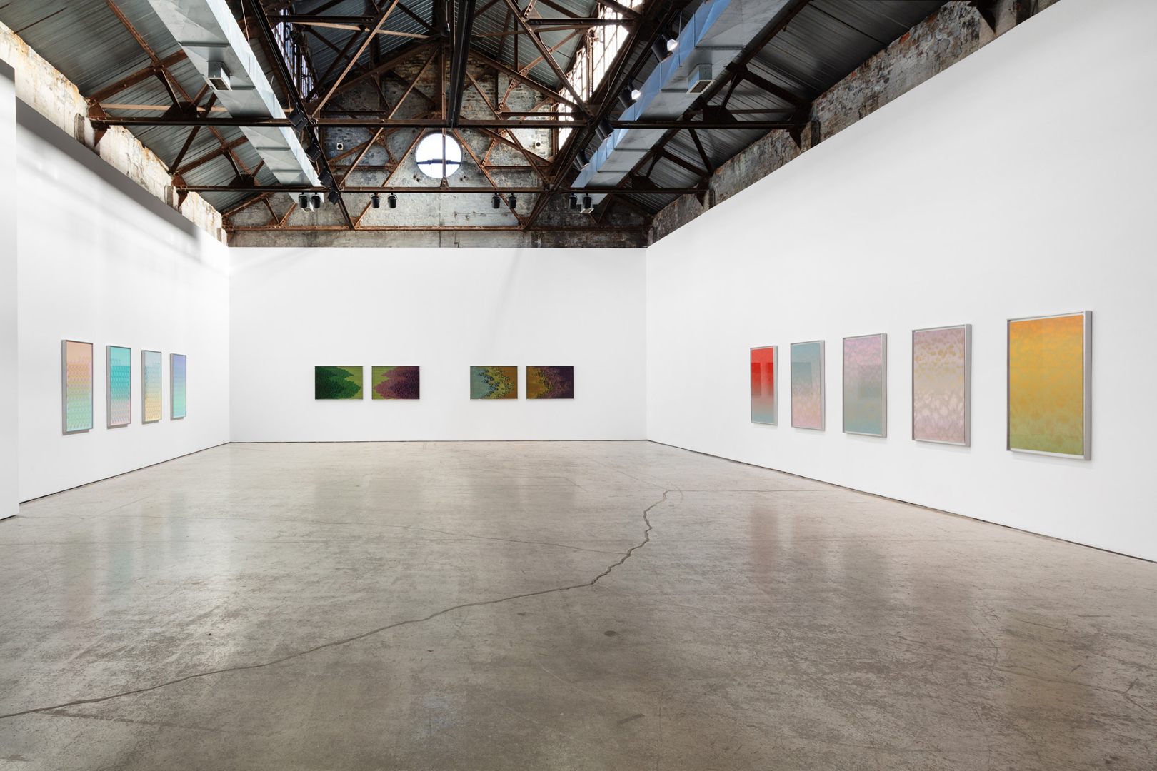
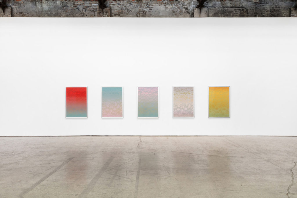
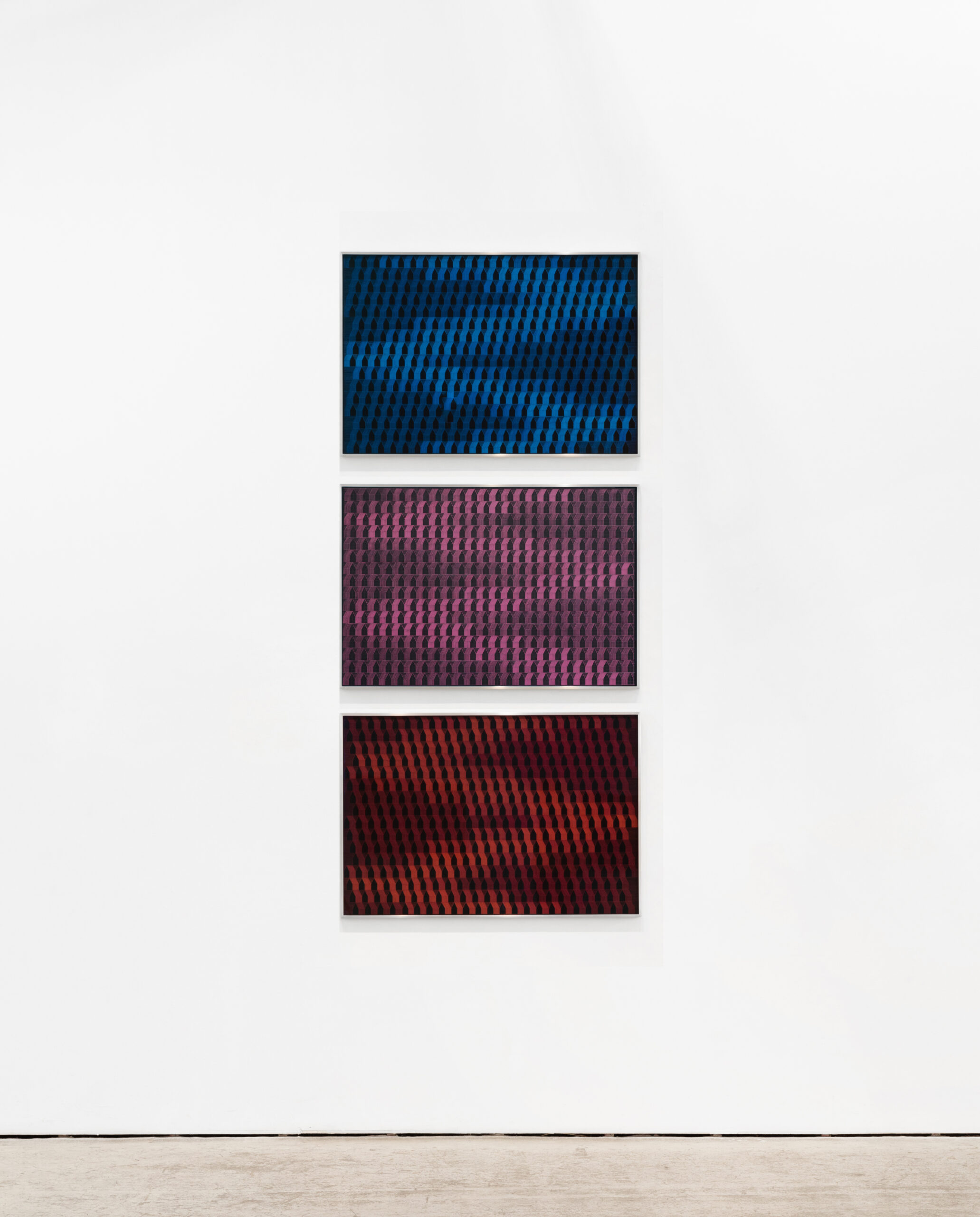
Installation View -
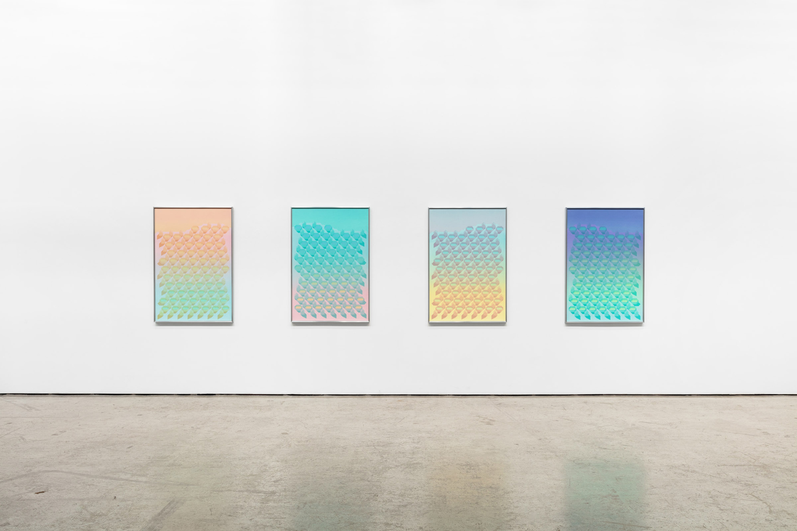
Installation View -
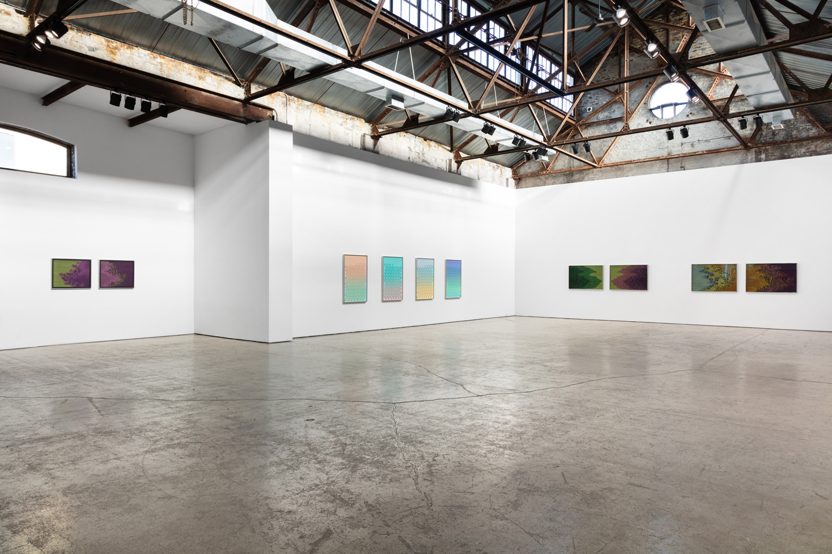
Installation View -

Installation View -
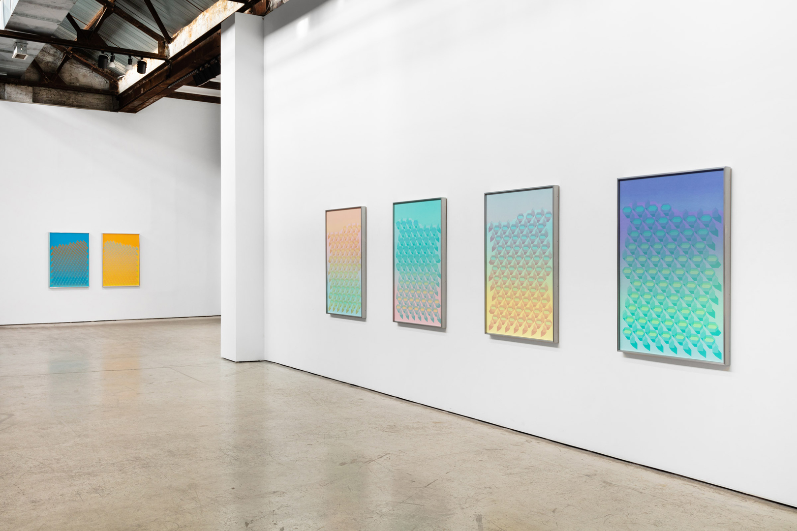
Installation View -
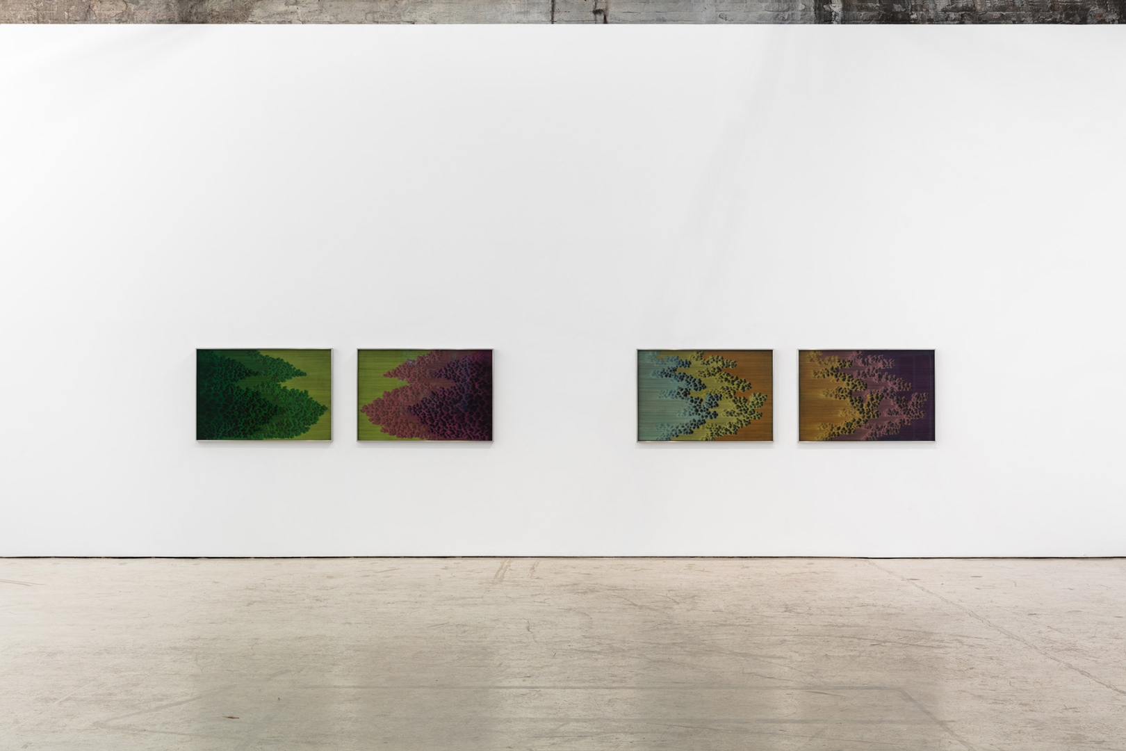
Installation View -
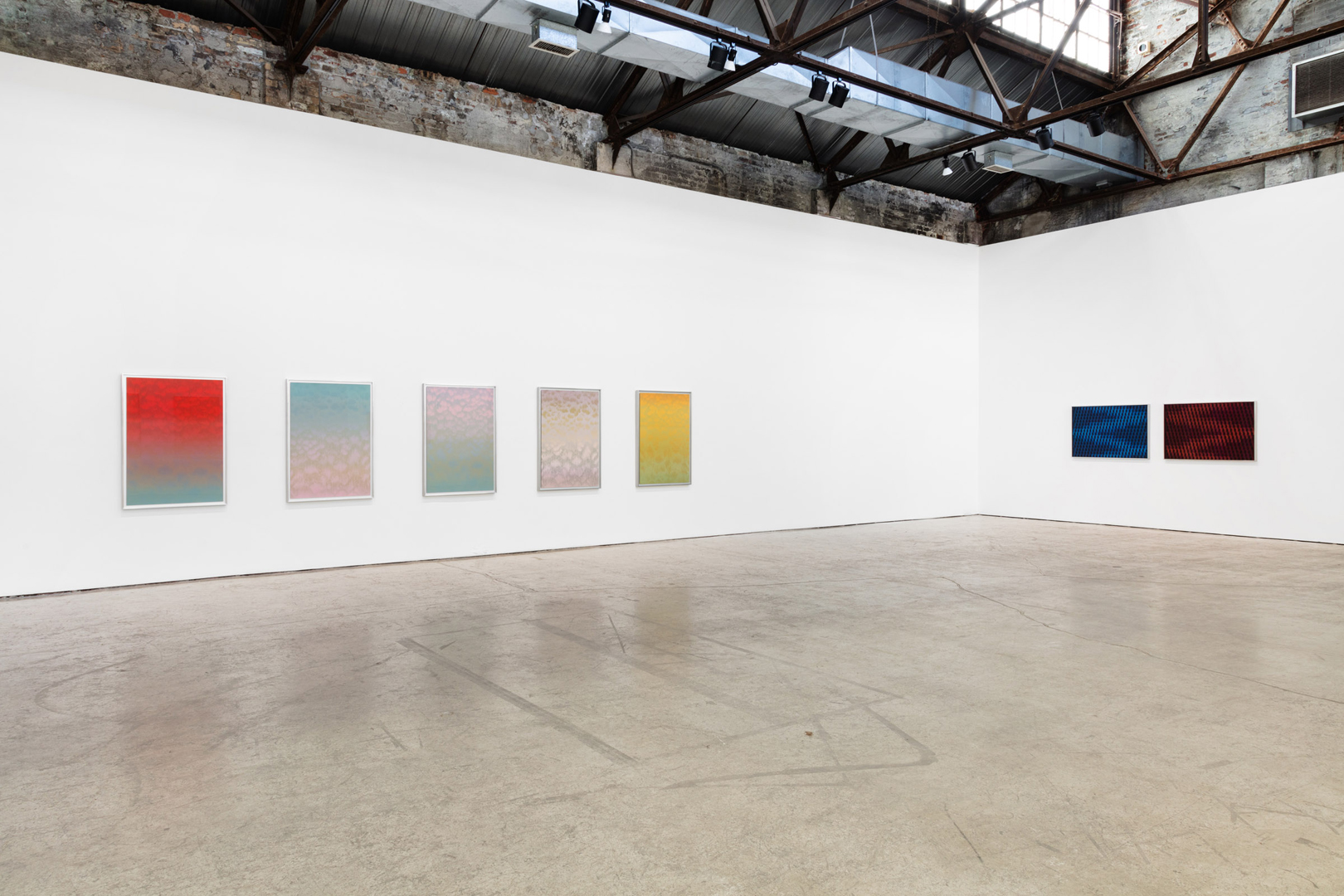
Installation View -
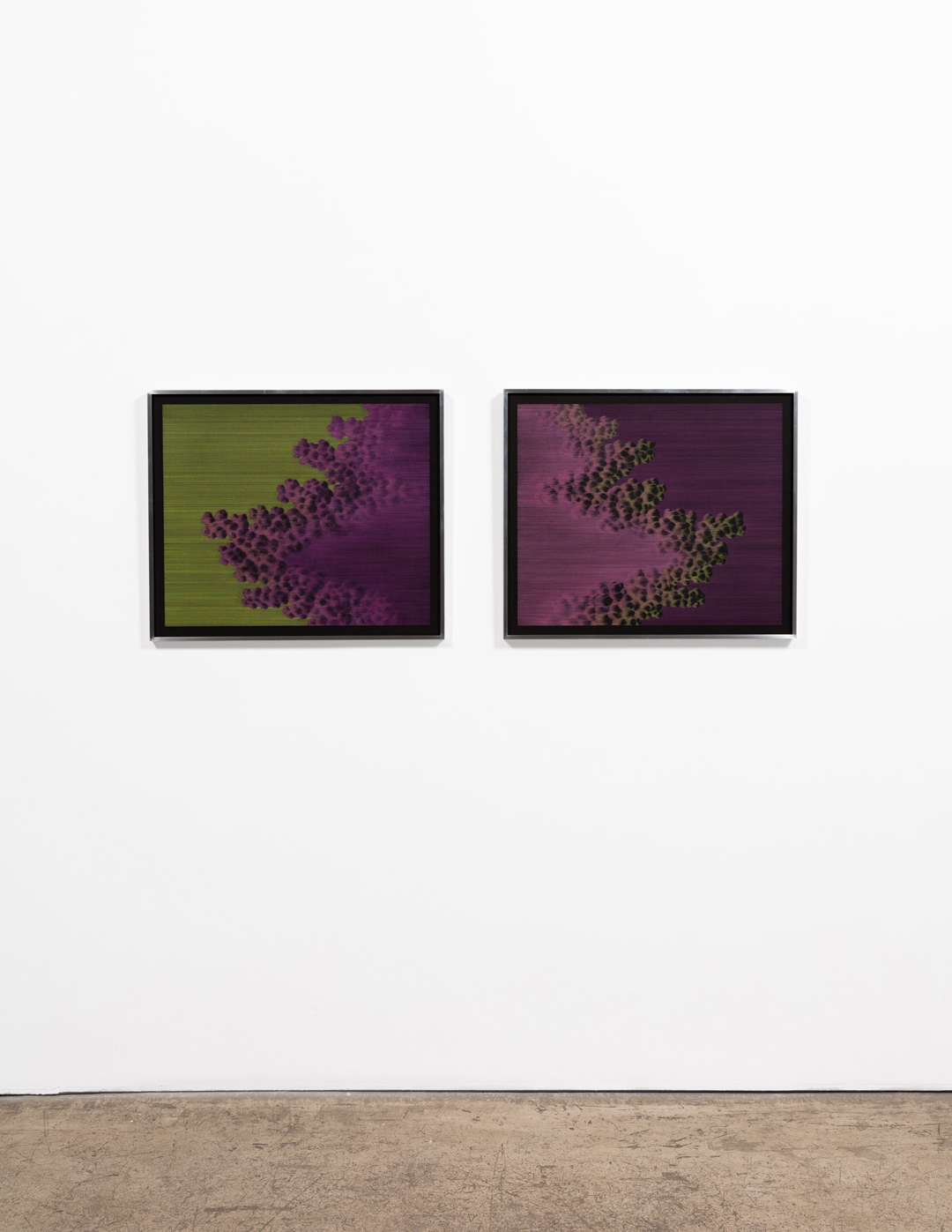
Installation View -
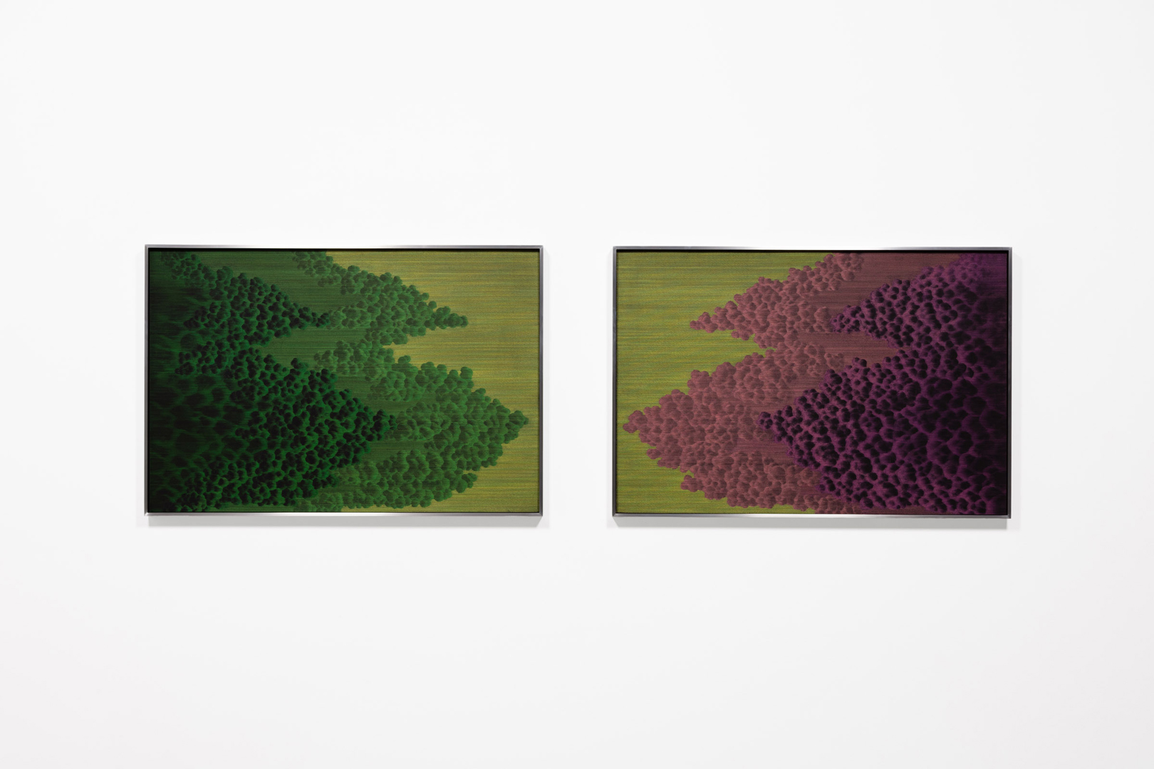
Installation View -
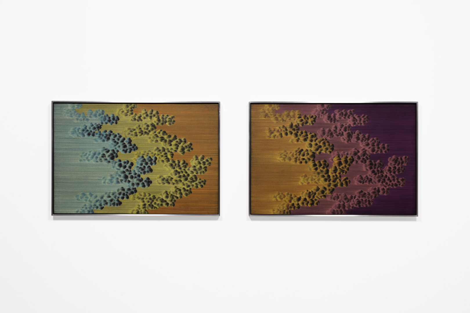
Installation View -
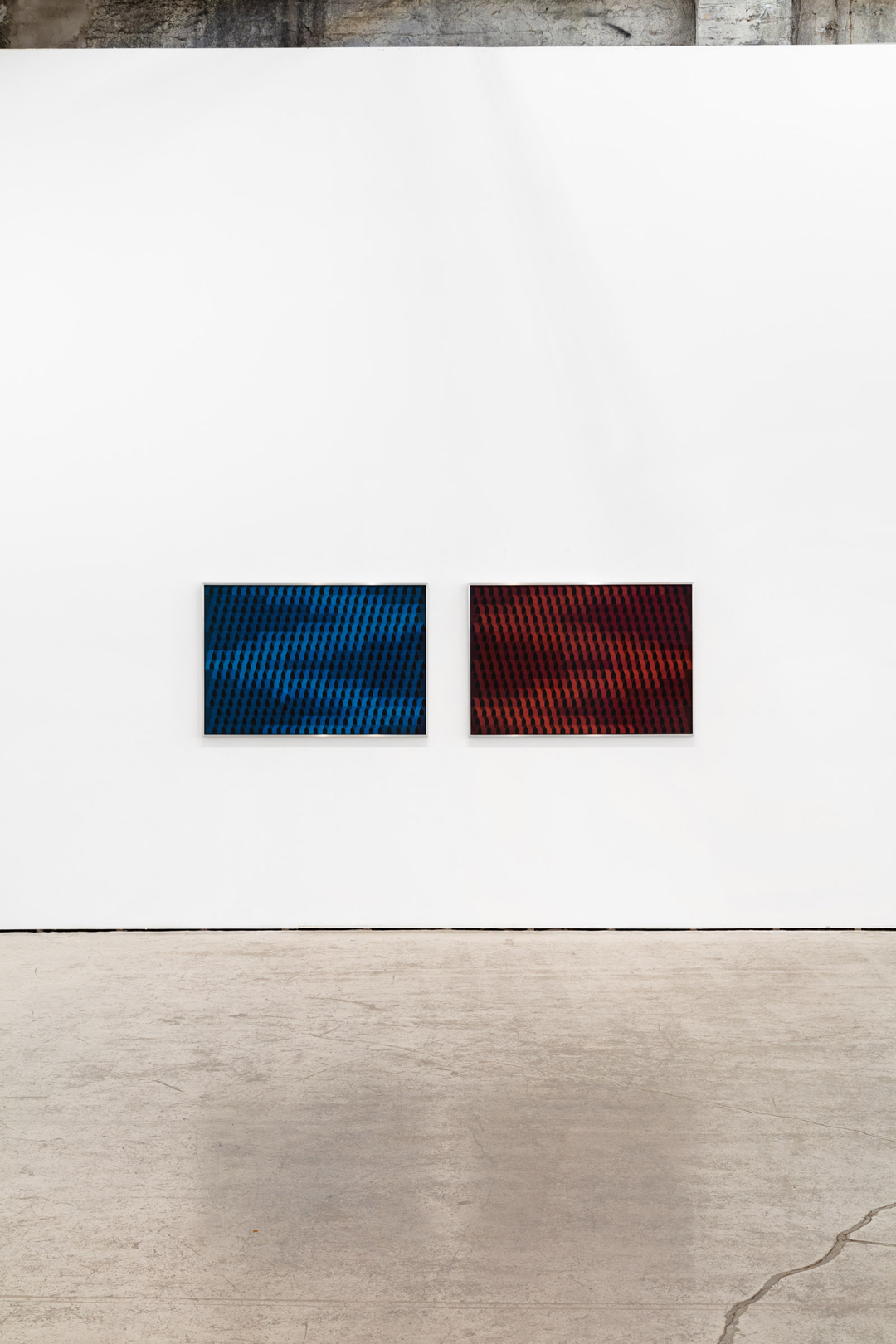
Installation View -
Installation View
Artist Meaghan Hyckie and her colleague and friend, the Winnipeg-based artist Sylvia Matas, discussed works in Hyckie’s exhibition, Ursula Not Ursula, at Olga Korper Gallery, November 14 – January 9
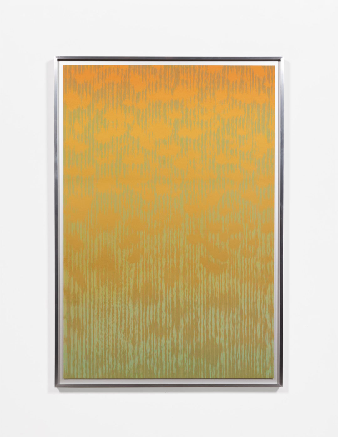
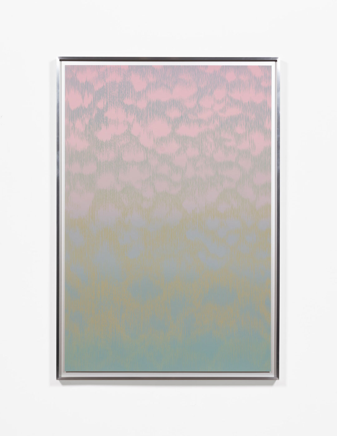
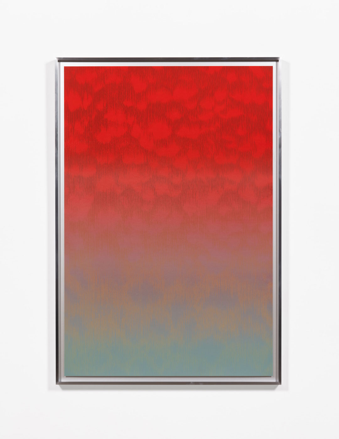
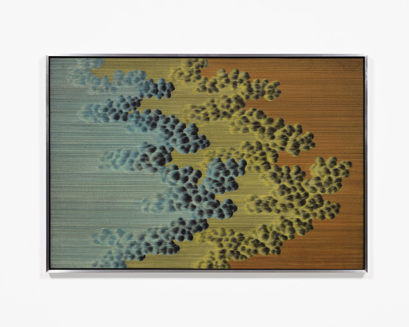
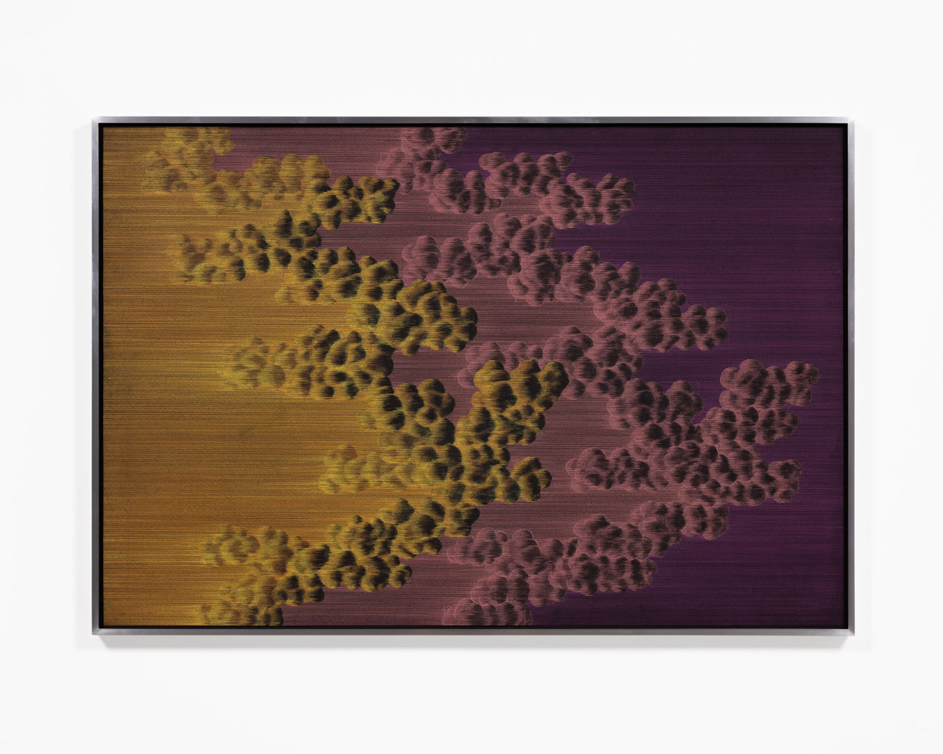
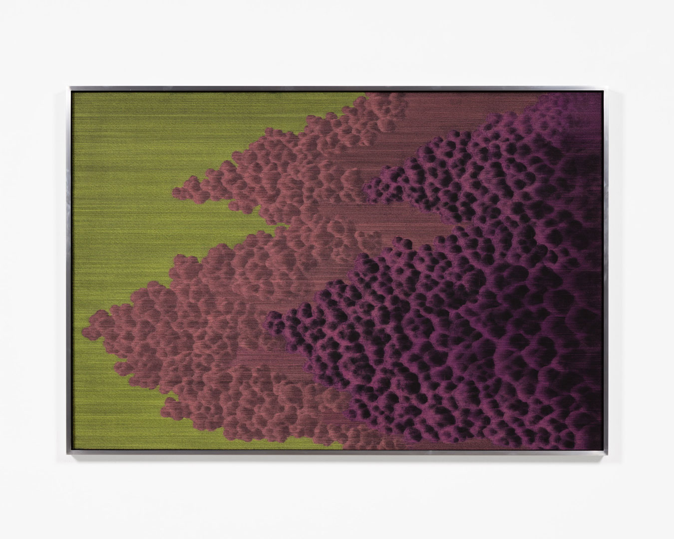
Syliva Matas: Some of your titles like DOS and IRIX are the names of computer operating systems (OS). It makes it seem like there is some sort of logic behind the cloud imagery, like a sequence of events is established but we don’t know where it will lead. How do you see the relationship of the cloud imagery to an OS?
Meaghan Hyckie: The way I approach art-making is like an OS. I find creative freedom in restrictions like limiting the materials and imagery I use. The OS titles for the cloud drawings and prints are meant to open up associations for this work outside of traditional landscape and atmospheric interpretations. Digital space is so elastic and I want this work to feel that way too, like these cloud forms could be atomic or astronomic.
I also want the OS titles to connect to the mapping themes in my work about the suburbs. I think suburban planning and OS’ have a lot in common; they try to control behaviour by organizing space in ways that reflect different ideologies: utopic, totalitarian, both. This is always complicated by the context that shifts around these systems after they’re built. The iterative nature of OS’ and the suburbs is very much what this work is about: versioning, obsolescence, dying, reincarnation.
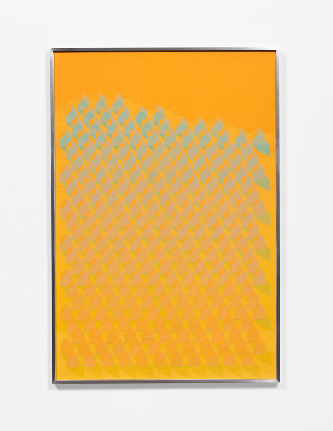
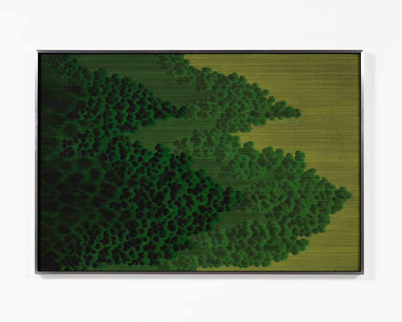
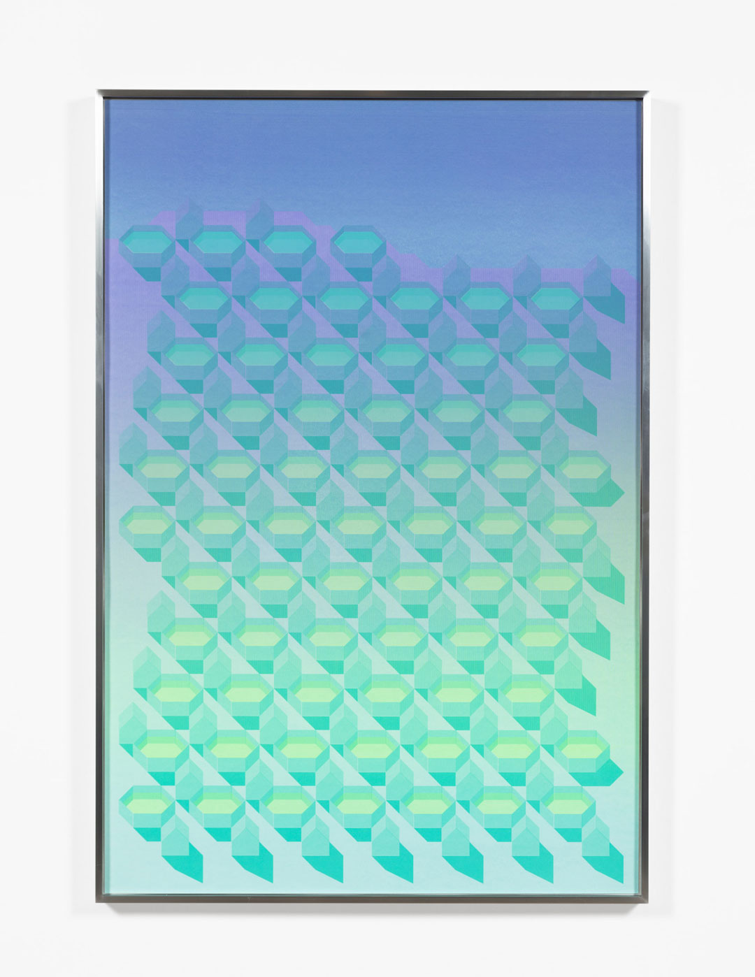
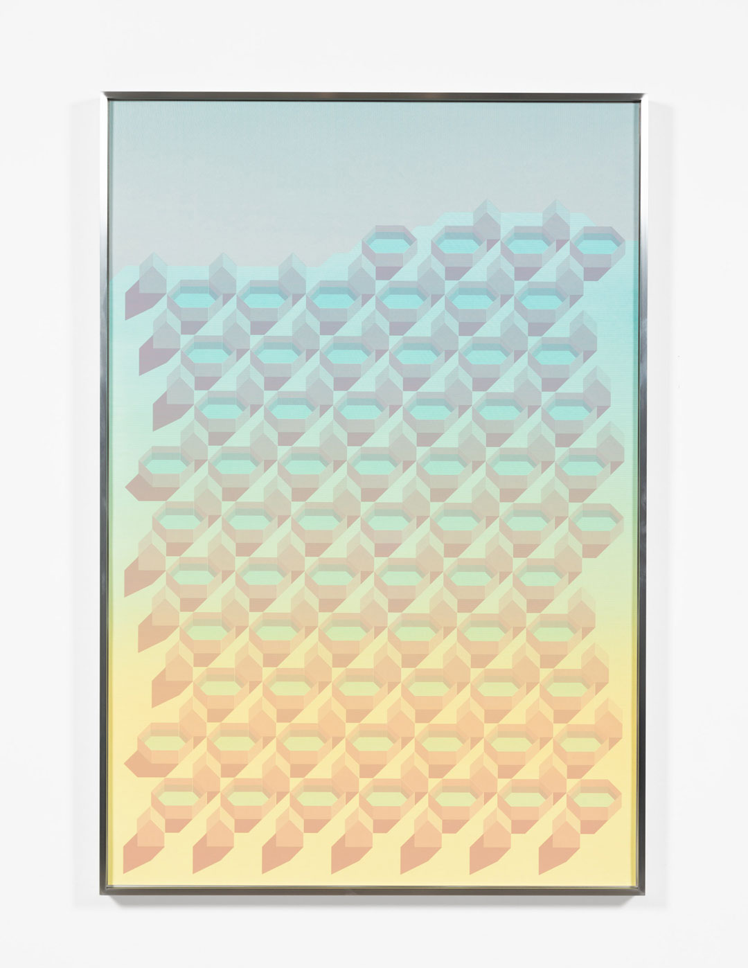
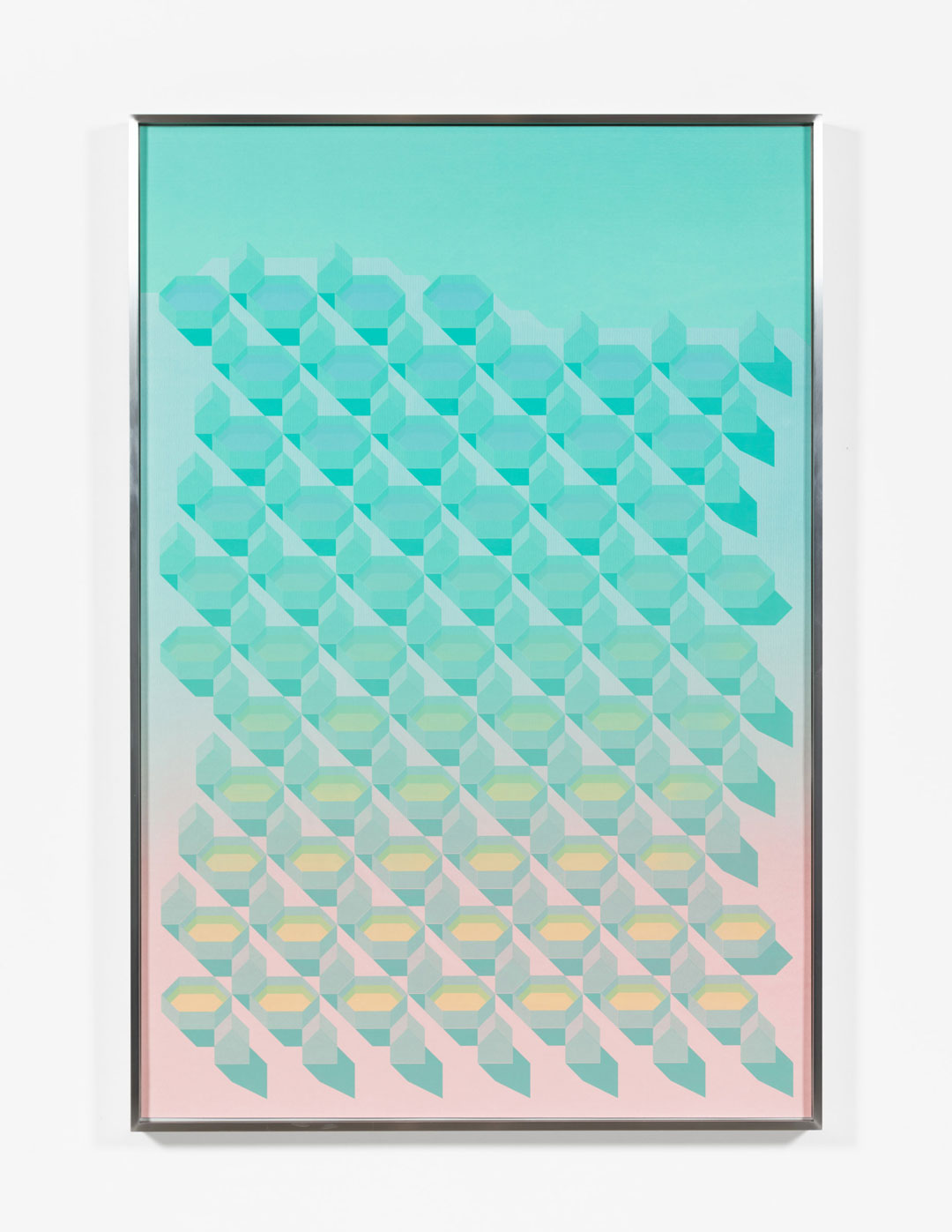
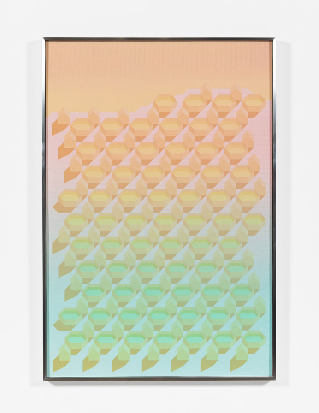
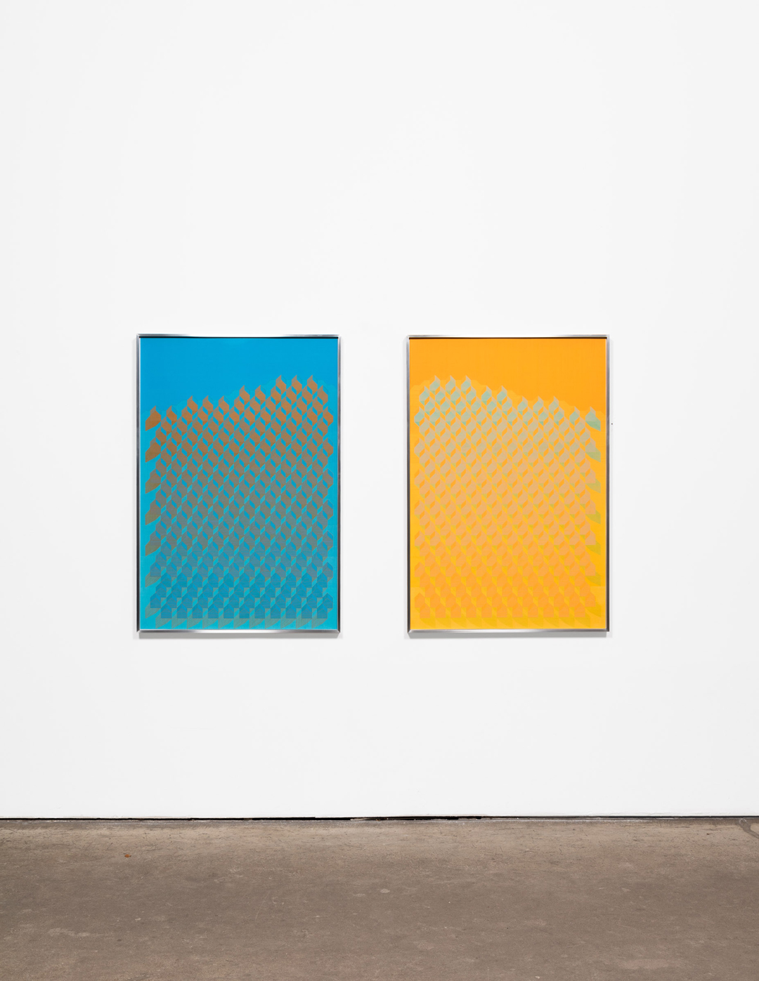
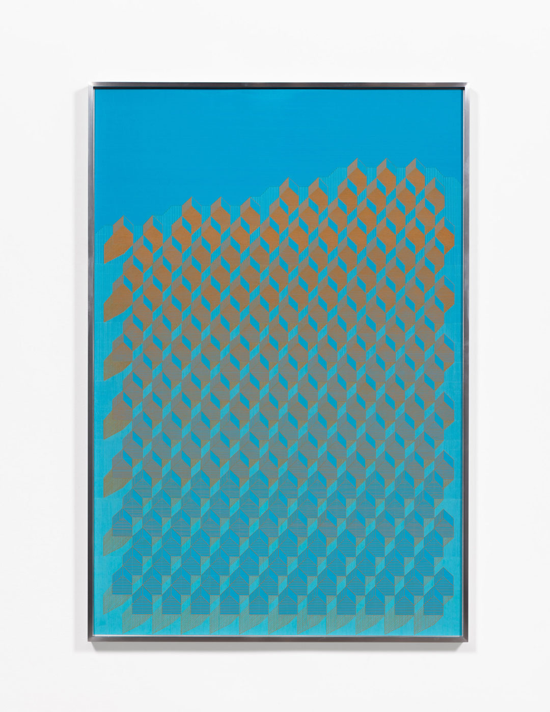
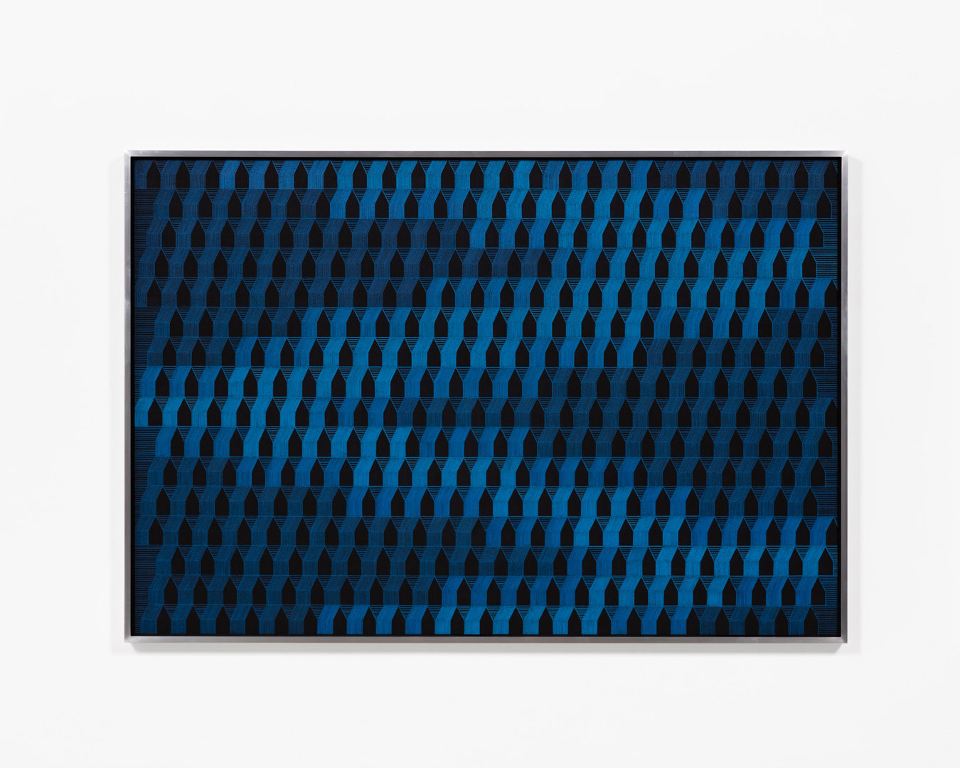
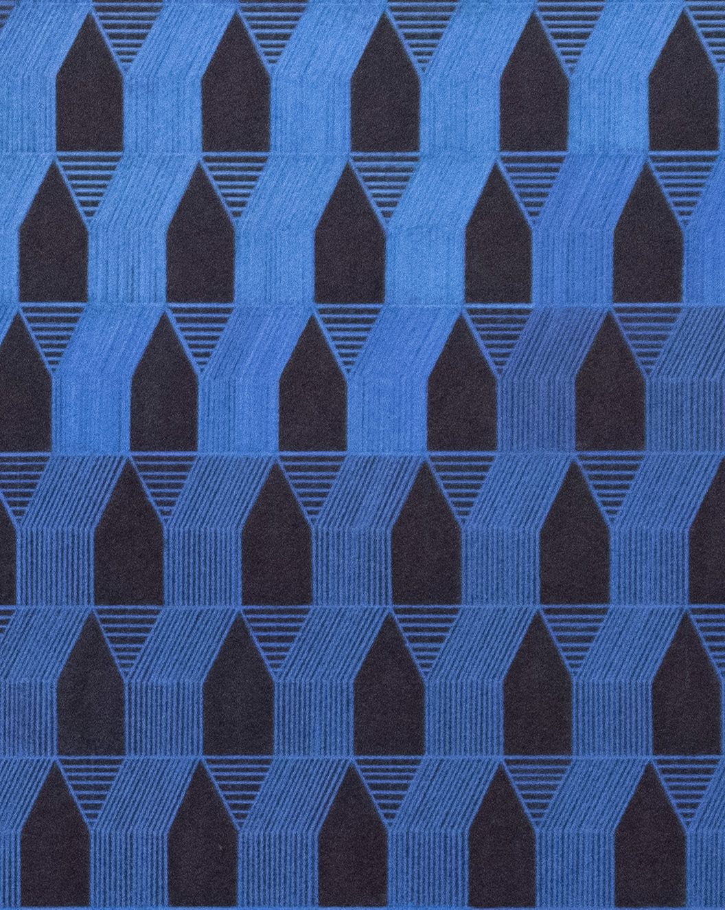
As my eyes move across the Rises drawings and screenprints the houses dissolve into abstract shapes and reform into houses again and again. Are the houses going through some kind of transformation?
Yes, but it’s unclear into what. A couple of years ago I did some research into Wartime housing, documenting early suburban housing sites across Canada. I saw so many homes in different states of transformation. Some original structures were in total disrepair while others were immaculately kept up, added to, or demolished. It was clear that from the moment these homes are built they start to change. There is something so poignant and disturbing about striving for stability and control through home ownership and lawn maintenance. No matter what you do, the foundation is not fixed, the ground will move beneath your feet.
There is something claustrophobic about these groups of houses repeating and repeating with little space between them. In Rises-3 the houses seem more solid at the top which makes me feel like they will continue to expand upward and fill the page. In Rises-4 the house shapes seem to deteriorate toward abstraction as my eye moves up the page. Are these worlds appearing or disappearing?
Both. I wanted these drawings to make and unmake themselves as you look at them. I was looking at Anni Albers’ weavings a lot at the beginning of this year. I could see parallels between weaving and drawing, the way groups of threads or lines can build forms. The process for making these drawings was like a puzzle, and I approached it like weaving, working with warp and weft/horizontal and vertical lines. I wanted there to be this moment in the middle of each composition where the delineation between the house forms and the spaces between them becomes very ambiguous. There are sections of the drawings where the contrast between these zones is more clear, with the houses moving forward at the top with the ground receding. As your eye moves down the image this figure/ground relationship starts to transition and completely flips by the time you get to the bottom of the drawing.
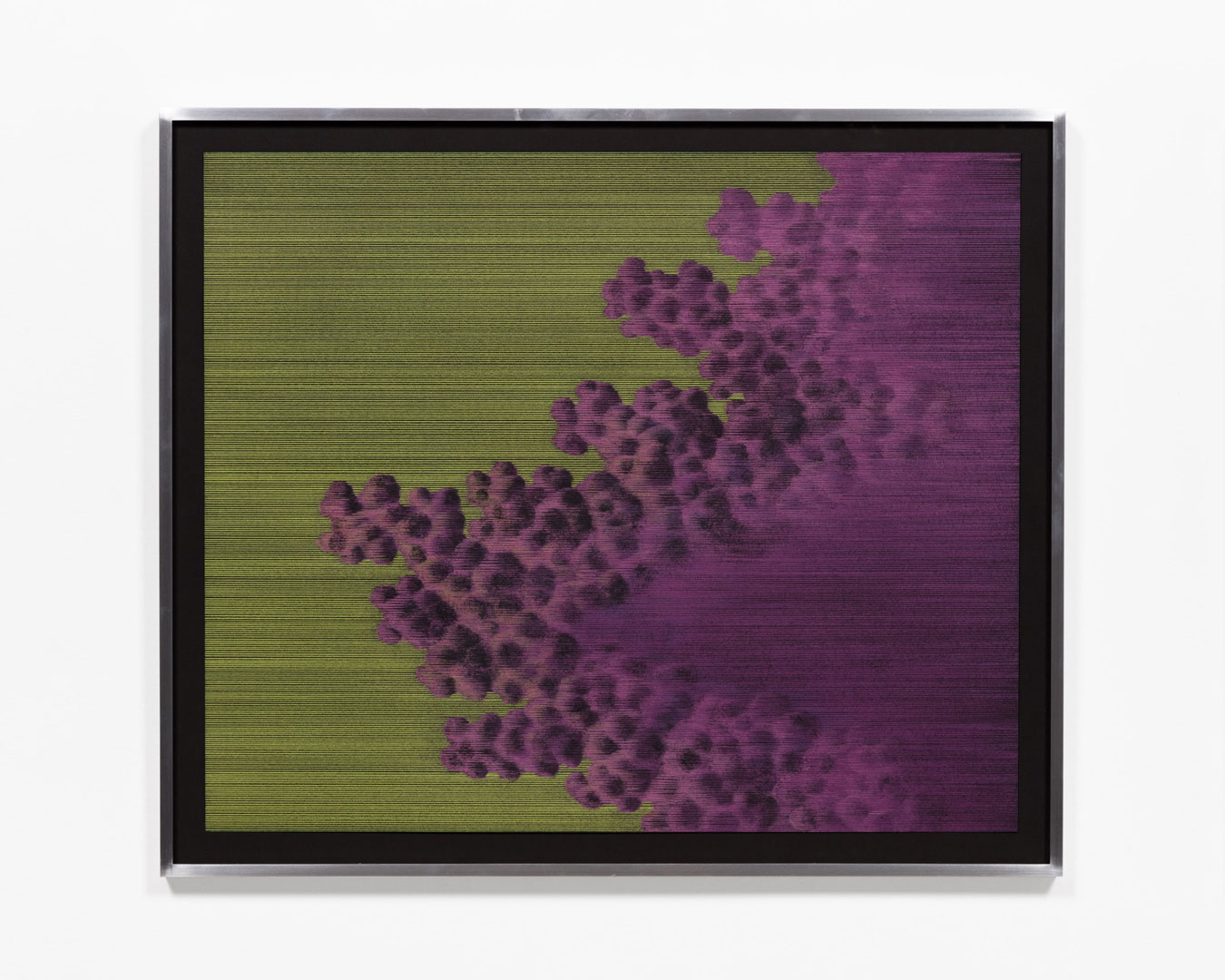
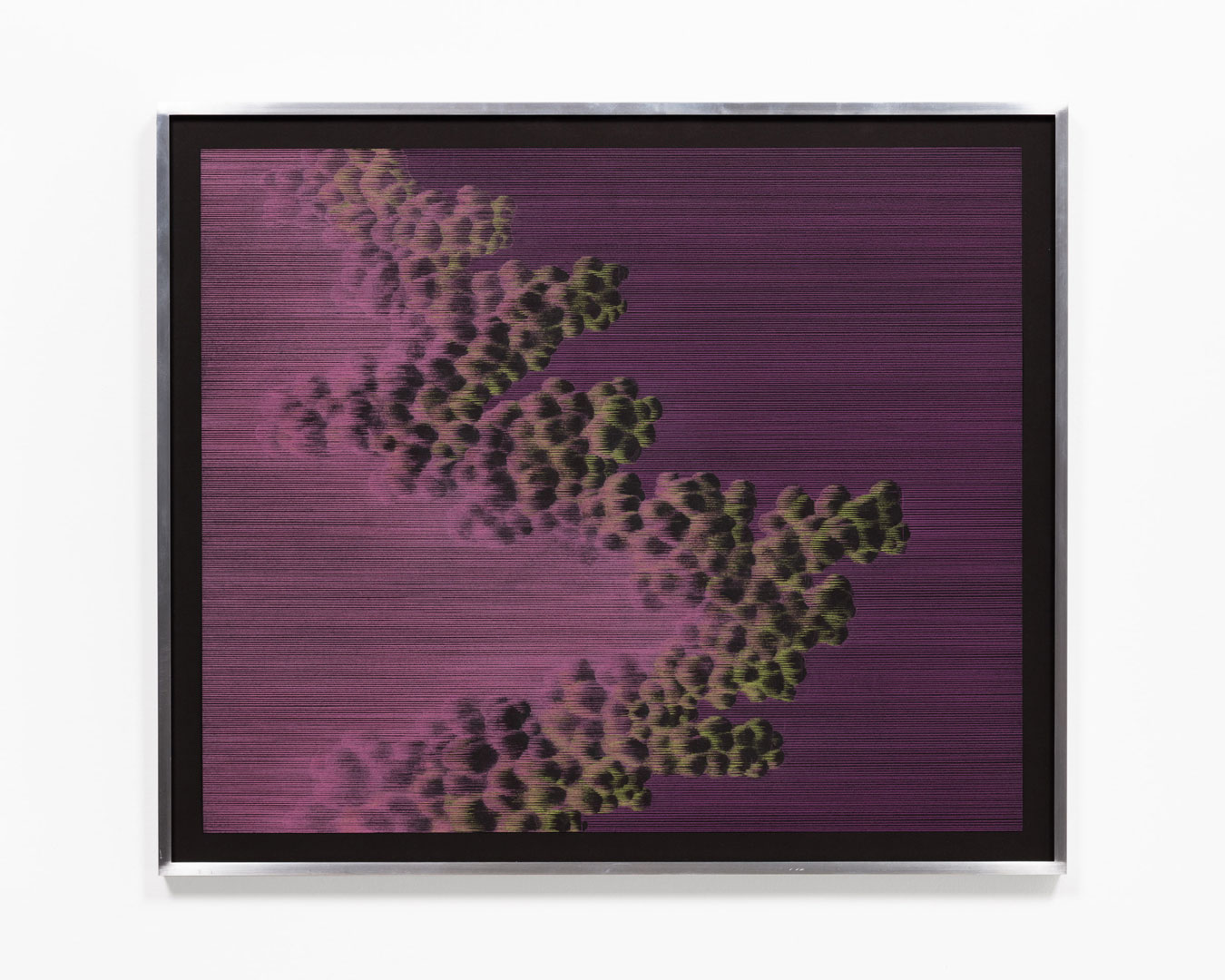
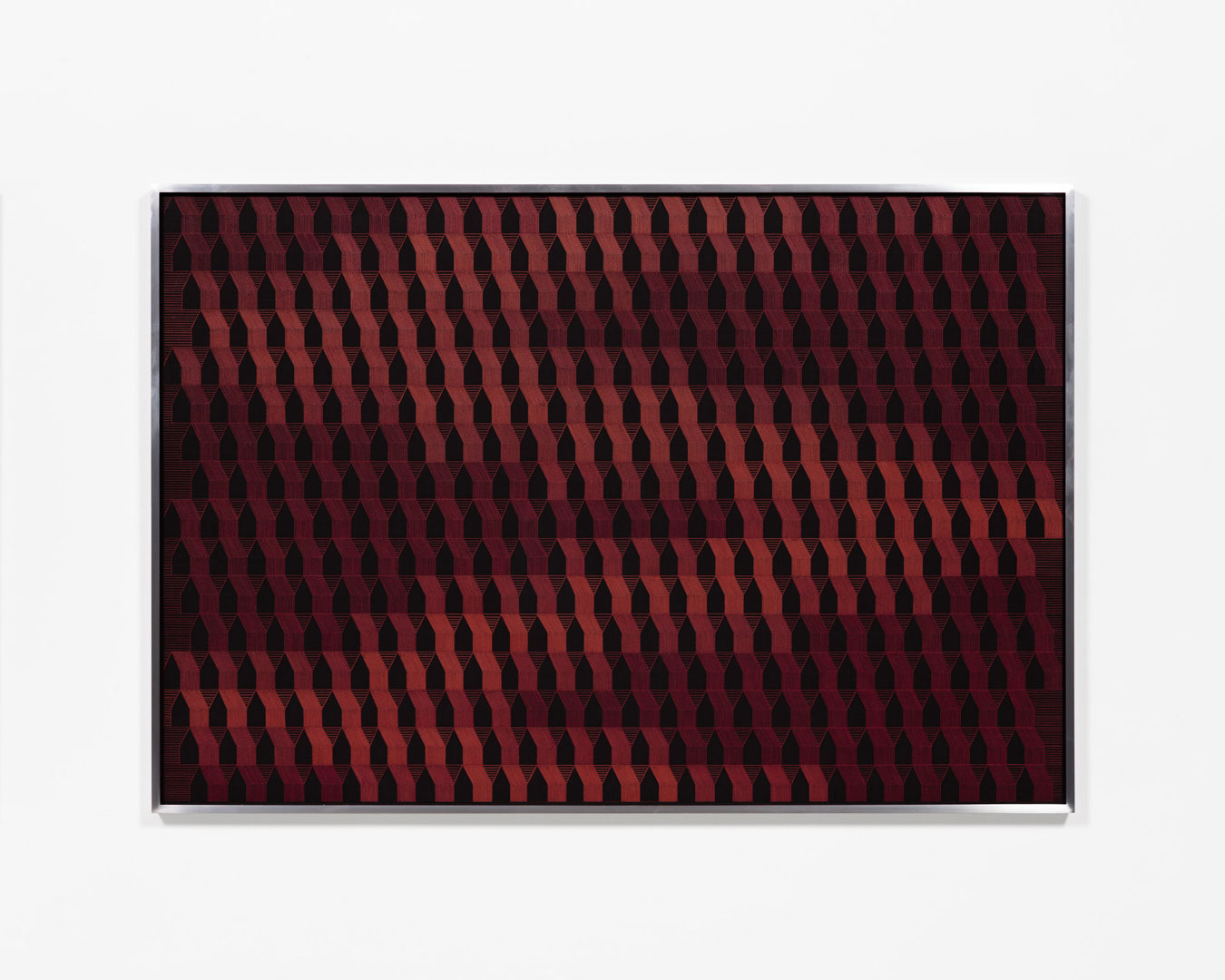
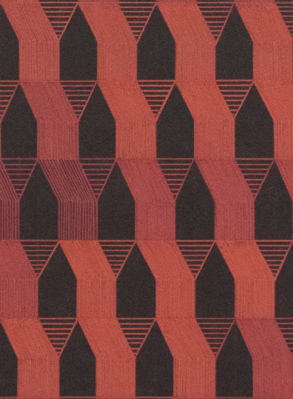
Claustrophobia is a compositional theme throughout this new body of work that I hadn’t considered. With the IRIX screenprints I’ve removed any space for the viewer to orient themselves in; the image is rammed right up against the picture plane so that if you’re looking at it, you’re in it.
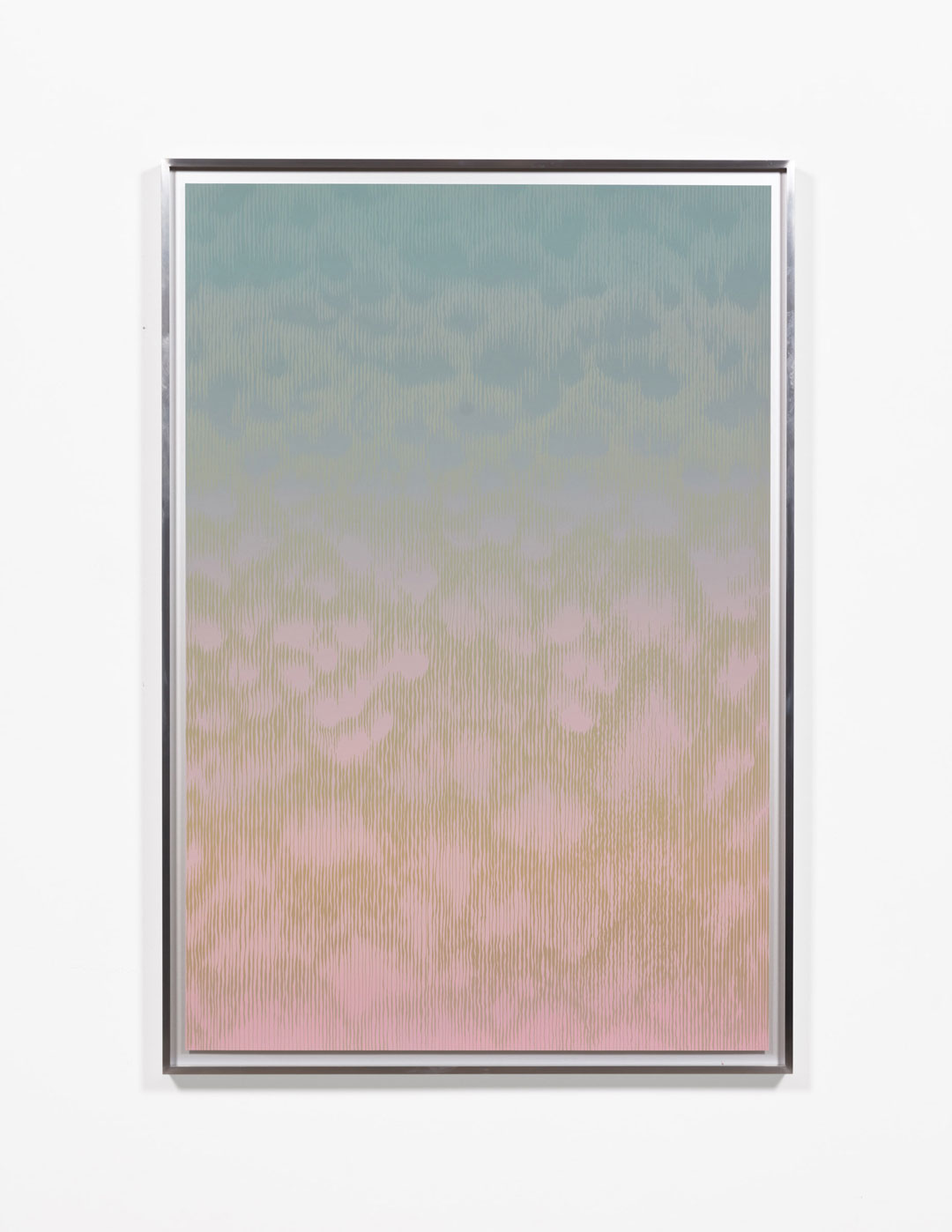
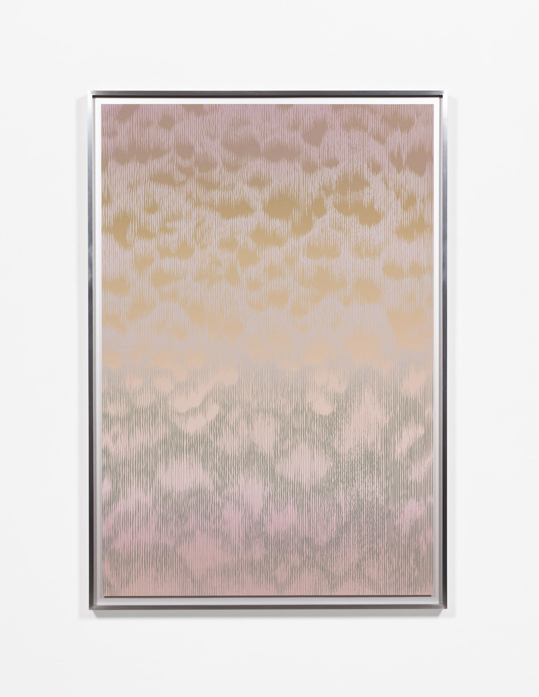
There is an artificial quality to the colour/light in the Rises works that gives them a dystopian feel, leading me to imagine these groups of houses undergoing an artificial sunrise and sunset. In the IRIX series, the colours seem acidic and metallic which makes me question if these are clouds that could exist on earth now, in the future, or even on another planet. Clouds and houses are familiar images – are you interested in using colour to defamiliarize us with these seemingly familiar icons?
Yes, absolutely. I gravitate to iconography that is kind of vapid and sentimental precisely because of this opportunity to twist it. I think imagery needs to be familiar in order for it to be possible to transform into something truly uncanny. I use colour to create an emotional key or mood that is at odds with the way these images are usually represented and interpreted. My iconography is simple and recognizable so I like to make it hard to see. Even though intellectually the viewer understands what they’re looking at, they have to squint and move their eyes and even their body around the work to make sense of it. The work is meant to function on a sensory, emotional level.
Artificial light and the way it interacts with and emanates from houses and buildings at dusk, dawn and night time really interests me. I have this repeated experience of running uphill as the sun rises near my apartment. There’s a whole mix of light sources at that time: the glow of the rising sun, the street lights and general urban haze, with a few squares of coloured light from inside the houses. These multiple light sources are what define the forms I can see, which appear flat and in silhouette, while the shadows they cast give a sense of the ground. It’s a very abstract time of day.
I think visual uniformity can often evoke calm, especially in an abstract image. When these abstract shapes materialize into rows of houses that feeling of calm becomes mixed with a sense of unease. The uniformity of the houses makes me think of totalitarian design or a world of forced conformity. How do you see the relationship of your work to abstraction? Are you interested in this tension that can occur when familiar forms can dissolve into abstraction?
Yes. I think that tension is why I’m so interested in the house icon. I grew up in a house that looks just like that: a rectangle with a triangle on top. I associate all kinds of memories and feelings with it, almost like it is alive. But it’s just a building, one of many thousands that are identical. This dissonance is what I find interesting, that the form and the feeling of home are literal and figurative abstractions.
The patterns I’m exploring in my work speak to that cloistered feeling of being in a suburb. They’re also connected to the optical claustrophobia I’ve felt when looking at op-art, which reminds me of suburban aerial photography. Last December I saw a
Bridget Riley retrospective at the Hayward Gallery that really impacted me and has definitely found its way into my imagery. While my work is becoming more abstract I can’t see myself going total Bridget Riley and existing solely in the realm of parallelograms and triangles. That feels too sterile for me. I want the forms in my work to be emotionally messier and more associative. ____________________________________________________________________________
Sylvia Matas is Winnipeg-based artist working in video, bookworks, text, and drawing. She received her MFA from the Chelsea College of Art in London, England. Her work has been exhibited at the Art Museum at the University of Toronto, Gallery 44 (Toronto), the Maclaren Art Centre (Barrie, ON), Plug In ICA (Winnipeg), Mercer Union (Toronto), Truck Contemporary Art (Calgary), Útúrdúr, (Reykjavík), the Winnipeg Art Gallery and YYZ Artists’ Outlet (Toronto). Her videos have been screened at Smart Projects Space (Amsterdam), Harvestworks DMAC (New York), Helen Pitt Gallery (Vancouver), Gallery Homeland (Portland, OR), Eyelevel Gallery (Halifax).
Meaghan Hyckie is a Toronto-based artist. She is represented by Olga Korper Gallery and her work has been shown across Canada, including exhibitions with Galerie Nicolas Robert (Montréal); Open Studio (Toronto); Macaulay & Co. Fine Art (Vancouver); the Art Gallery of Windsor, and Museum London. Meaghan has been a resident at Vermont Studio Centre, the Banff Centre, and was a 2018 Doris McCarthy Artist-in-Residence. She gratefully acknowledges the support of the Canada Council for the Arts and the Ontario Arts Council, and a special thank you to Smokestack Studio.
Included Artworks
artwork detail
artwork detail